Reflecting on the Hierarchical Task Analysis
Hierarchical Task Analysis
Pros and Cons
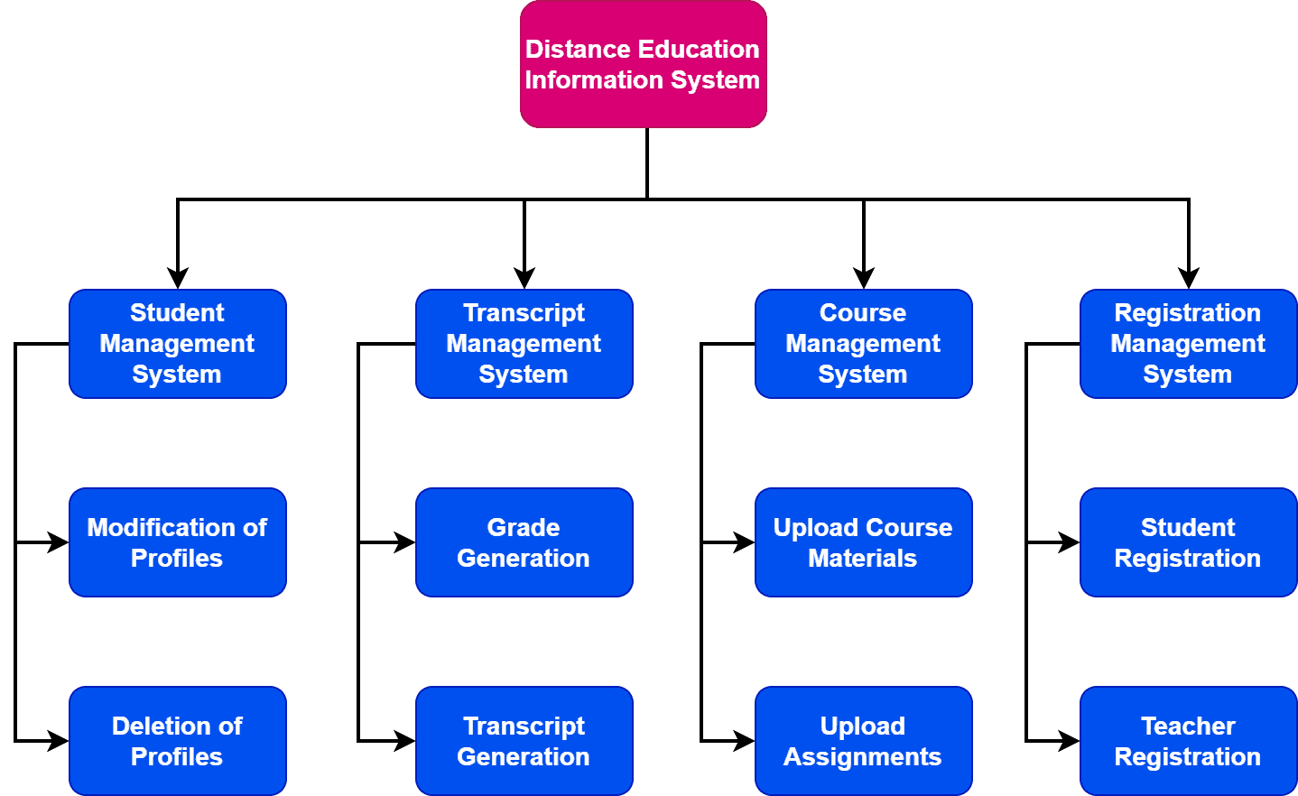
My team and I chose to use Mural to show the HTA of using the self-service machine in the library. The first problem was knowing where the task started. Should we include "Get a book from the library" or is that too obvious. But what if they expected to check to see if the book is available and checking it out was something done before hand? But most libraries would have you get the book prior so we went with finding a machine for the first step. We tried keeping all the instructions concise to try and prevent them from feeling overwhelmed. We used lines to help direct the viewers attention to the corresponding steps and subcategories. The subcategories that we put below were the options they would see on the screen. We didn't include any plans for if something went awry to avoid confusion.
Our team also made a HTA for how to make tea. It seemed simple enough but once I started talking with my team I realized we all have different methods. I am ashamed to say that I pushed to simplify the process by using the simplest method rather than the method that was the best at representing a variety of methods (culturally) of making tea. In the hope of making things more easy I excluded whole groups of people are their way of making tea.
Pros
- Uses visual representation that's easy to understand and navigate by most people
- Flows well (Sequence is easy to follow)
- Encourages concise language to keep things simple
- just gives essential information so its a very quick and easy "downloading" of information
- Can't go into too much details or it will get chaotic and confusing
- It can be difficult as designers knowing where to start and how detailed it can be without confusing the user
- doesn't highlight any problems users can have and how to resolve them
- cultural differences aren't representing. Implies there is one way of doing a set task and doesn't account for the variety of users
Work Objective Decomposition
Reflection
Focuses on the users objective rather than their behaviors. With clear objectives it eliminates the need for steps or a plan for the user. With significant objectives further details are given. A con of this process is no priorities are assigned. Another is if the user has a problem there's no information to address it.
Example:
 Example found here!
Good and Bad Designs:


This reflection on the Hierarchical Task Analysis is insightful and clearly explains how breaking tasks into smaller steps improves understanding and efficiency. I especially liked how the process was structured, making complex activities easier to follow. It also highlights the importance of planning in achieving better outcomes. Approaches like this are really helpful for students who often think “make my assignment” when tasks feel overwhelming. Overall, a well-thought-out reflection that connects theory with practical application nicely.
ReplyDelete